collingham
Tuesday 12 January 2016
Misconception Day Of The Shoot
Overall i thought that the day of the shoot went very well. By starting at 10am it gave everyone a chance to arrive to the first location on time. We started off be running through the lines with the actors, giving them a chance to relax a bit and get to know the crew. We then moved on to shooting the first scenes on that location which went well, we experimented with different shots and angles to give us lots of content to work with when it came to the editing stage of the film. After we completed the shooting of our first scene we moved on to the next location which was about half an hour across London. Everyone arrived at the next location on time. We started off by running through the lines for the next scene we were going to film and took a lunch break at this moment as well. The shooting for the next scene also went very well with the crew working well together tho get everything prepared together which was need, for example preparing the sauna and the costumes for the next scene. After this was filmed we thanked everyone for their handwork and let them know we would be in touch later with details of the final cut and premiere of the film.
Monday 11 January 2016
Advanced Poster Analysis
In this post i am going to do an advanced analysis of a poster from another film falling into the thriller category/genre.
The film poster i am going to be performing this advanced analysis on is Prisoners. Prisoners was a film about the abduction of a mans daughter and his daughters friend. The father takes matters into his own hands to find the girls.
The Poster:

As you can see on the top left of the poster they have used lots of Star Billings to highlight the calibre of the actors and actresses playing roles within the film.
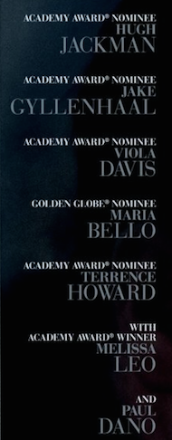
You can see how they have highlighted each of awards the actors have been associated with or won. This can give the audience encouragement as they can see that the actors and actresses have seen quality in the film otherwise they would have not signed up to the film.

In the main title of the film on the poster the "O" has been filled in with a maze. This creates a connotation for the audience of mystery. This is used to draw in audiences who are fond of this sub-genre. It is also a slight hint at the narrative of the film which is another enticing factor for audiences.

If you look just below the title you can see the films tagline featured. This is small enough to not stand out but large enough to be noticed. It gives the viewer of the poster the feeling that it is always there. Almost nagging them, constantly making them aware of what the main point of the film is about.
They have featured the release the date of the film at the bottom of the poster which isn't necessarily the best place to put one of the most important elements of the film however they have counteracted this problem by displaying the release date in a white font. There reason for doing this is that it stands out to the viewer of the poster clearly.
Pictured above is the films title taken from the movie poster. It has once again been displayed using a white font. As i mentioned previously the selection of this font colour would have played a big role in the prominence of this element of the poster. It also creates a link between the film title and the release date for audiences to latch onto.
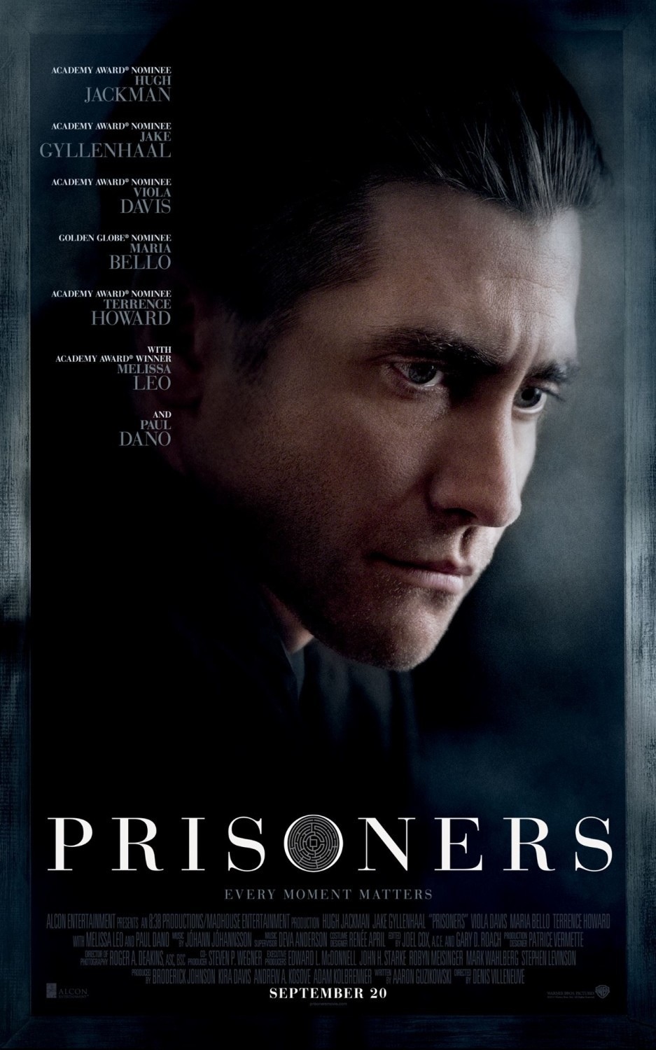
Coming back to the overall outlook of the poster, they have chosen to use a still from the film featuring one of the main actors. The reason this has been done is to provoke association of the audience with this actor. The actor, Jake Gyllenhall is very well known. This can also be interrupted as a connotation of quality due to the success of previous films this actor has appeared in.
I would also like to mention the colours in the still which has been used as the backdrop for this poster. It has a very desaturated look which is quite typical of a thriller film. It also feels quite moody which is another connotation of a thriller film.
Ideal Music
In a world where copyright didn't exist or we had the budget to use whichever songs we wanted in our film i have selected these few for use in our film.
Ideal Actors
In this post i am going to list which actors i would have playing the roles within our short film should our budget be bottomless.
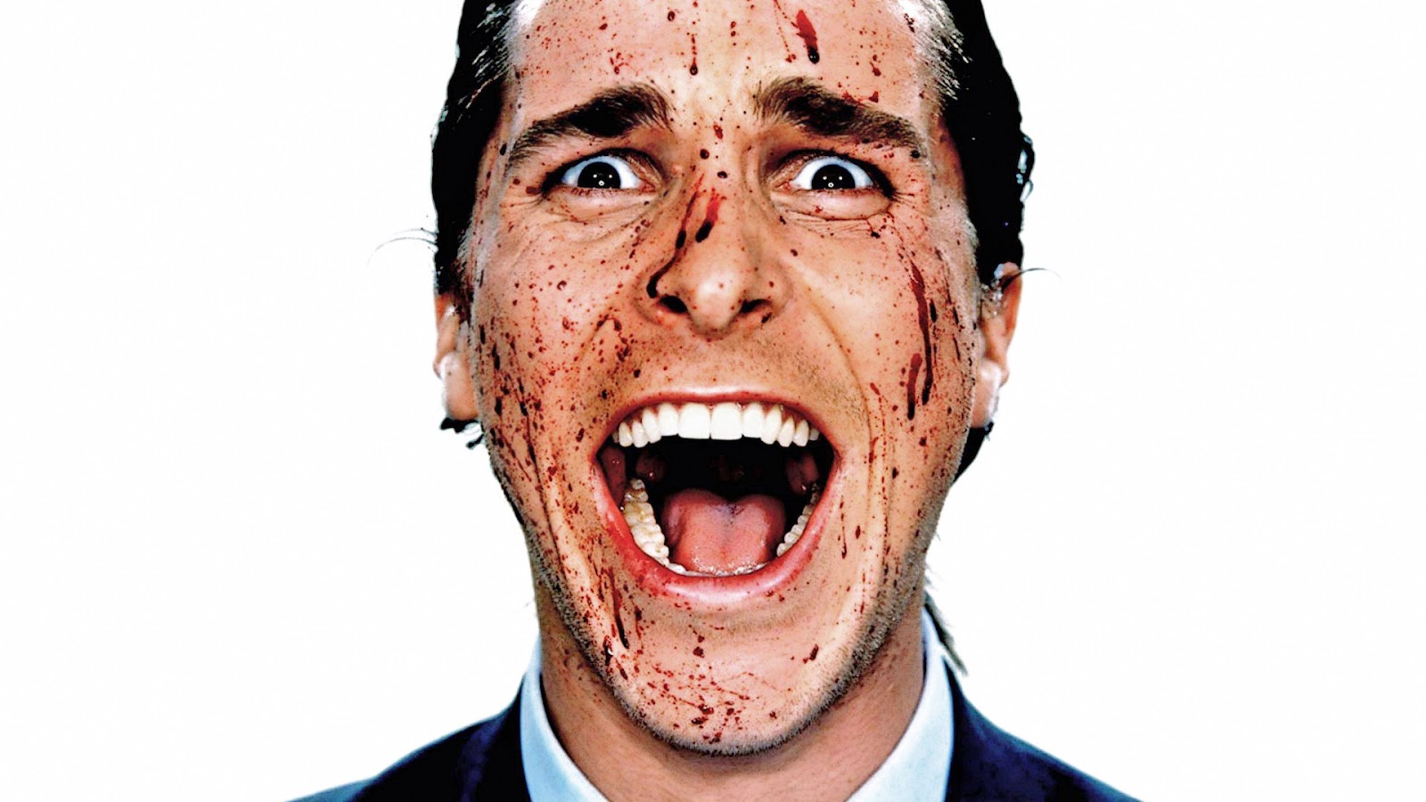
Nathan:
For the part of Nathan i would cast Christian Bale. The reason for this choice is based on the performance of Christian Bale in American Psycho. He portrays the psychopathic killer in this film to the greatest extent possible.
Eliza:
For the part of Eliza i would cast Chloe Grace Moretz in the part. The reason for this is due to her prolific acting skills and also the fact that she looks quite young which fits in well with the part but she brings in a lot of experience.

Lily:
For the role of Lily i chose Anne Hathaway. The reason for this is that she has played the mother/wife type role well in the past. The only point i would bring up is that we could cast someone slightly younger to fit in with the role.

Software For Our Film

To create this graphic i used a software called Photoshop. The reason for doing this was to create a nice looking image which had similar characteristics to that of the editing software.
Hardware For Our Film
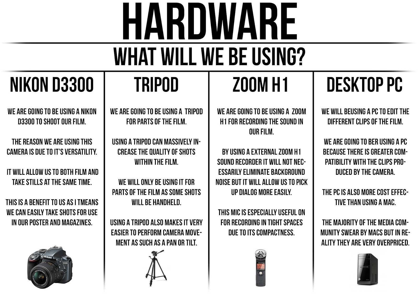
To create this post i used Photoshop as i thought that this would be the best way to display our equipment in a professional manner.
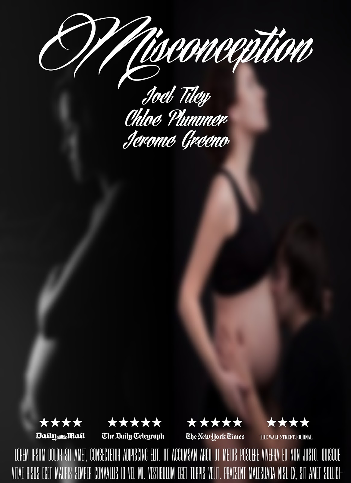
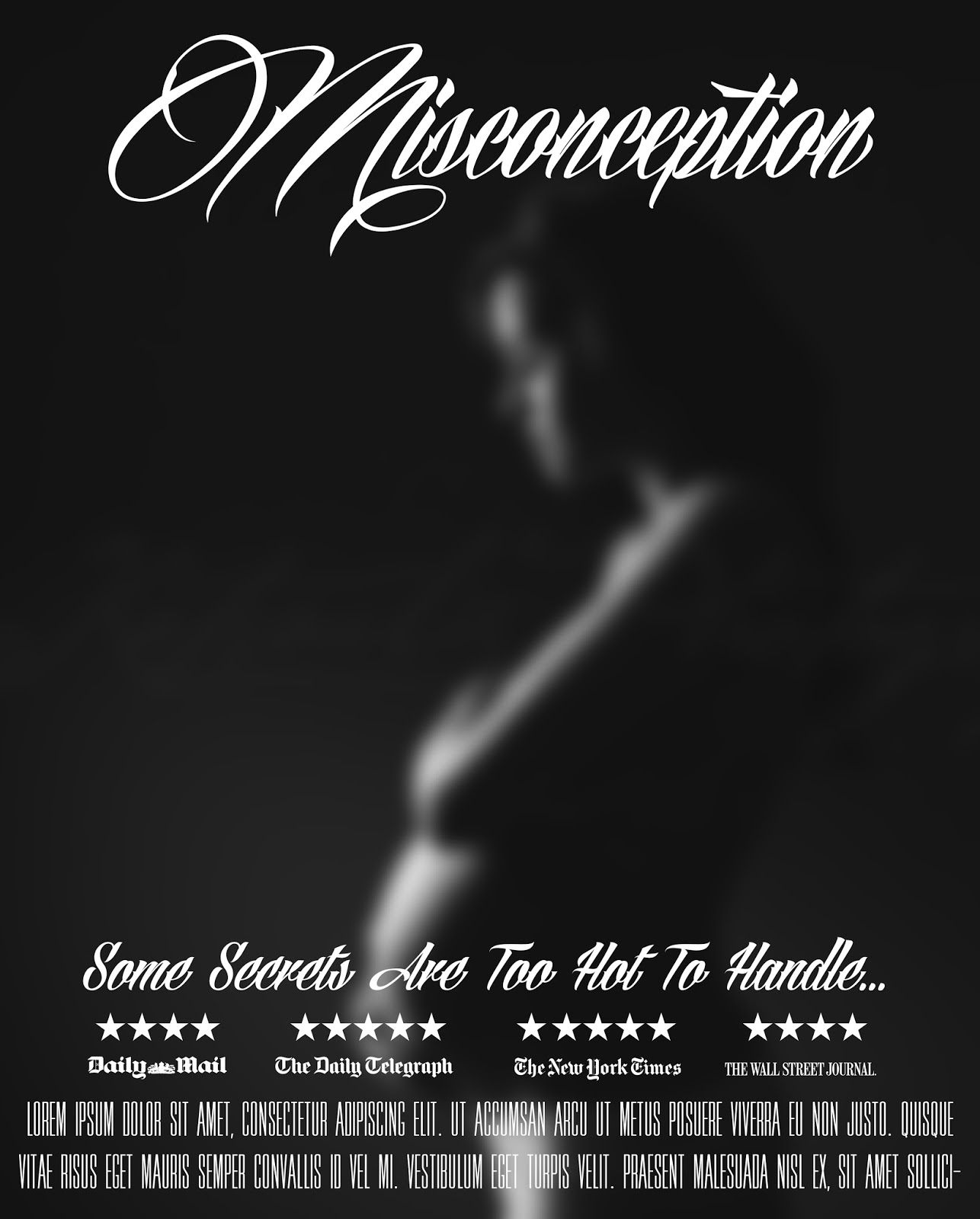
Poster Mock-Ups
Here are some preliminary poster mock-ups we have done for our production Misconception. These are being used to get an idea of what we could do for the final image.
Monday 4 January 2016
Calendar Update
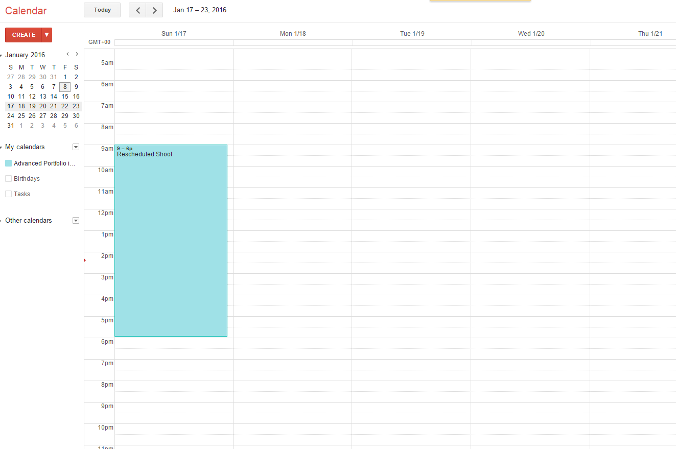
When it came to a week before the shoot, our actress for Eliza dropped out. Due to this happening we have had to reschedule the shoot for the film to the 17th of January 2016. Although this pushes us for timing in terms of editing the time frame is still manageable.

Subscribe to:
Posts (Atom)